
Moving the needle on fan engagement
I had the unique opportunity to work with a group of sports fans, to build a product that, in their own words, was going to move the needle on fan engagement. Here’s how it panned out.

Defining the Problem
I’d like you to imagine my friend, Andy. He’s watching Champions League soccer on his TV, and then someone scores a great goal - and Andy has no clue who he is. What does he do? He google’s him, of course. He looks him up, goes to his Insta, and hey, before you realize it, he’s reading about Dani Alves’ cats. He probably won’t even go back to watching the game.
Sports content today is still largely made for linear TV - and does not offer the same levels of interactivity that fans who are so used to Facebook, Instagram and Snapchat expect. Many content owners are therefore struggling with lower attention spans and retaining younger audiences. This is where Edisn comes in.
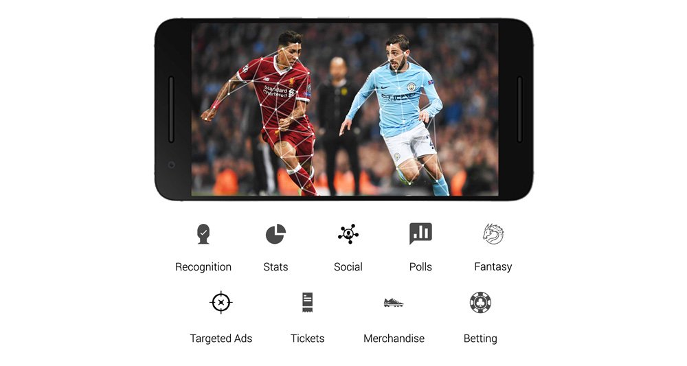
Using artificial intelligence and computer vision, the team built software that’s able to recognise players in real-time and provide interactive, personalised content to viewers. As a fan platform, it’s meant to provide an array of services to keep viewers engaged with the broadcast, and as a content owner’s platform it would provide a broad scope for transactional opportunities by deploying targeted ads, offering tickets & merchandise, and providing easy access to betting services. The best part is that it required no additional hardware; it works with current infrastructure and simply augments it. Neat and tidy!

Conducting Research
The first thing we did was look at the competition - or, in this case, the lack of competition. There are surprisingly few players in this arena, and it looked like there was little precedent for what we’re trying to achieve.

Netflix was dabbling with interactivity. We felt, however, that their implementation was very narrow in its scope, possibly because of the nature of their content. There was not much here for us to learn, aside from deploying binary choices. Not quite our cup of tea.

HotStar was about the closest we had seen to someone tackling sports interaction. They had introduced a platform for users to post messages and reactions to a public forum. They also provided basic match stats, and had created a rudimentary guessing game loop. While a good start, we felt that it was a fledgling attempt at fan engagement, without much focus or direction. and felt incomplete to us.

Twitch’s focus was on individual broadcasters, not 3rd party programs. However, their platform did have a rich social ecosystem, with depth and variety of interactions available to subscribers and the broadcaster. This held potential for us as a benchmark.
The next thing we did was research our target users. Edisn and it's sister company, SportyTrip, were chock-full of die-hard sports fans. So right there, we had 2 offices full of user personas, which we investigated thoroughly through conversations and semi-formal interviews. We then identified a bunch of external candidates that fit these profiles, and proceeded to interview them one by one. Broadly, our interviews started open-ended, then went in to some specific questions, then tapered away again into open ended conversation. We had to review and re-write some of our questions to remove the interview bias, which was a good learning experience. Once we had enough interviews compiled, a pattern started to emerge. Broadly, we could categorise the user stories into 3 buckets: Data Requests | Social Interaction | Transactional Opportunities.

We also did a rigorous round of internal brainstorming, to ensure that we weren’t missing anything obvious, from a product stand-point. We started with a simple How-Might-We thought experiment, left the results on the board for the day, and came back the next day to review and follow up with another session where we started compiling relevant ideas on a board. We again left it up for the day, and came back the next day to follow it up with another round.. which produced abysmally low returns… so we called it, and decided to work with all the data we had compiled.
Planning
Our first few sessions were to plan out a roadmap, so that everything we did could be measured against it. Stage 1 was an MVP. Once that was accomplished, we decided to tackle the issue of scaling the platform to be usable from a content provider’s perspective. And once that was underway, we decided we would focus our time and energy on public relations. Additionally, we created personal, team and management goals, all of which were to be chased on a weekly basis. Some were good-to-have, while others were fundamental to the smooth functioning of the sprints.

We conducted sessions where the team sat together to build out the product framework. This was a very fun part of the work; investing the team in the product by getting them to design the logic behind it.
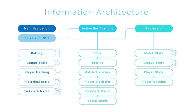
Together we discussed and built the logic behind the interface framework, and then dived into individual feature flows, until we had a high-level AND in-depth understanding of what we needed to build.
Wireframes, Design & Iteration
Once the fundamentals were in place, we had a platform which we could experiment with. We took our core features and built out interfaces for them for several sports, to test the flexibility of our underlying framework. Once we had a clear vision of the future, we started making several wireframes to address the genres that we had identified for our MVP. Broadly speaking, we wanted to make sure that we had covered different scoreboard styles, interaction types, and data display configurations that could be adapted to any kind of broadcast situation.

A few of the wireframes we developed to test the MVP viability.


Eventually, these wireframes were boiled back down into their essence, and turned into a micro-site for internal use. The idea behind this micro-site was to communicate the fundamentals of the system in a manner that needed no prior exposure or education to design, to enable consistent decision-making by product and engineering. An early mockup of that micro-site is available to view here.

Design System & Framework
The design system I chose was was Atomic Design (link). Personally, I think it’s an excellent system because of its relatability; anyone from a designer to a developer to sales executive can understand the principles of the system, and converse in its language fluently in a very short time. The framework for design was an 8-pt Grid, which helped with standardization during the development phase. We wanted our entire app to be as un-intrusive as possible, so we played it fairly safe with our colours and typography. We went with the ever-reliable hues-of-blues for our colours, and used the bone-stock “Roboto” font, because it was ubiquitous in the world of app design. The idea was to have a showcase product that had all the bases covered, but with enough flexibility to customize the platform to any potential client’s brand guidelines, and we felt that with this combination, we had all the bases covered.
To test out our ideas, we went about and tried to design several components (organisms, in Atomic Design parlance) that followed the same underlying principles, but that all looked bespoke. We wanted to ensure diversity in our initial presentation in order to attract the interest of as many broadcasting companies as we possibly could.


Edge Cases
One of the important - and often overlooked - tasks of design is tackling edge cases. In this situation, our facial recognition algorithm was excellent, but with players going in and out of the frame, our labels were going all over the place. One of the studies I conducted was to identify as many edge cases as possible, and design the logic needed to accommodate each one. With each edge case we identified, it seemed like 2 more would appear in its shadown… quite a fun little exercise in demon slaying :)

Micro Interactions
Another critical part of the design process is the curation of each interaction. This, really, is where you win or lose your customers. A little disclaimer here; our engagement ended before we got down to developing our product at this level. However, I was well ahead of my schedule on this particular engagement and so I put in the time to define (and then refine) a few of the micro-interactions in the product.